Case Study / Product Design / FLOATME LOANS
Designing FloatMe’s First Installment Loan Experience
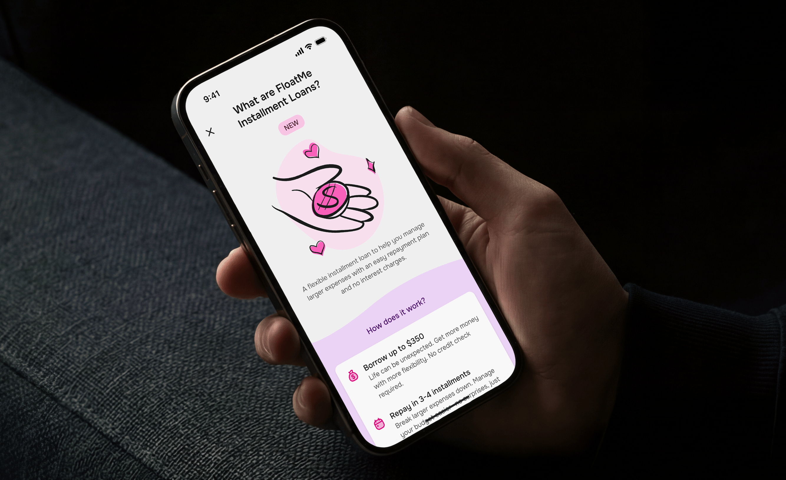
FloatMe started as an Earned Wage Access platform that allowed users to request small cash advances called Floats. The product worked well for short-term needs, but over time we began hearing the same feedback from users. Many had reached the highest Float tiers available and still needed access to larger amounts of money.
This project was FloatMe’s first step into installment lending. I joined during the earliest stages of product definition, before a final solution had been chosen, and worked on the project from research and discovery through UX, UI, testing, launch support, and iteration.
The challenge wasn’t simply introducing a new financial product. It was introducing a more complex product without losing the simplicity users already associated with FloatMe.
Project Snapshot
Design and launch FloatMe’s first Installment Loan experience, giving qualified users access to larger lending amounts through scheduled repayments while maintaining the simplicity and trust users already associated with the FloatMe brand.
Context
Before any designs were created, we spent time speaking with users.
I participated in more than twenty interviews with active users, former users, and prospective customers. While each group had different experiences with the product, the feedback was surprisingly consistent. People wanted access to larger amounts of money.
I need access to more money
Project Wayfinder results / April – August 2023
Many users appreciated Floats for covering smaller expenses, but when larger expenses appeared, they often had to look elsewhere. Several users mentioned they were approved for larger amounts through competing services and ultimately left FloatMe because of it.
Something else surfaced during these conversations as well. Many users struggled with cash flow visibility and felt they didn’t have a great understanding of where their money was going each month. While that wasn’t the primary problem we were trying to solve, it provided valuable context around how users thought about borrowing money and repayment.
At the same time, the company was evaluating two possible directions:
- Installment Loans
- Line of Credit
Both products solved similar problems, but each came with different technical, operational, and regulatory requirements. After exploring both paths, the decision was made to move forward with Installment Loans because it offered a faster path to market and fit better within the business and regulatory constraints we were working with.
Defining The Experience
One of the things I enjoyed most about this project was that the product wasn’t fully defined when I joined. We weren’t designing screens for an existing feature. We were helping determine what the feature should be.
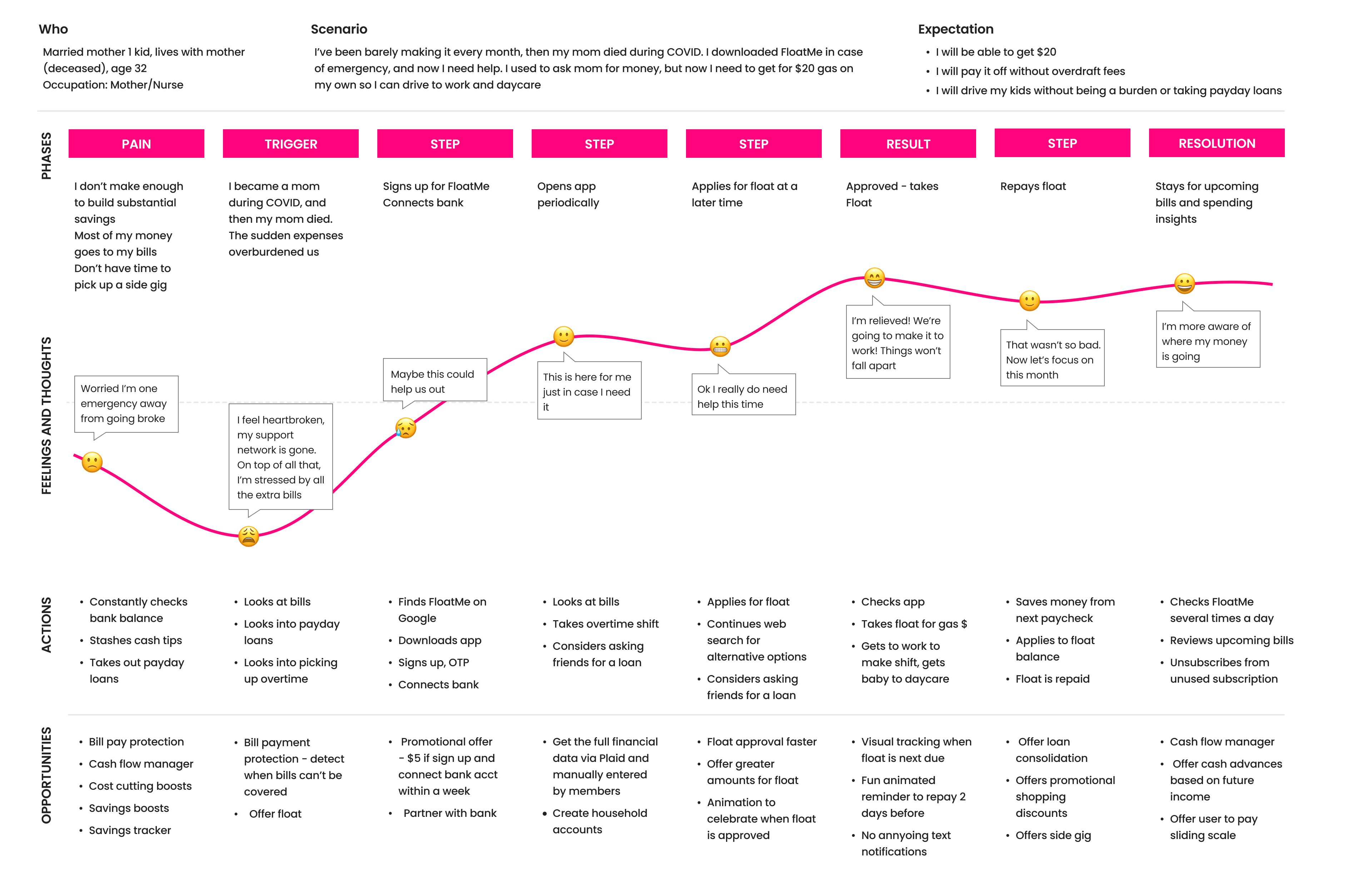
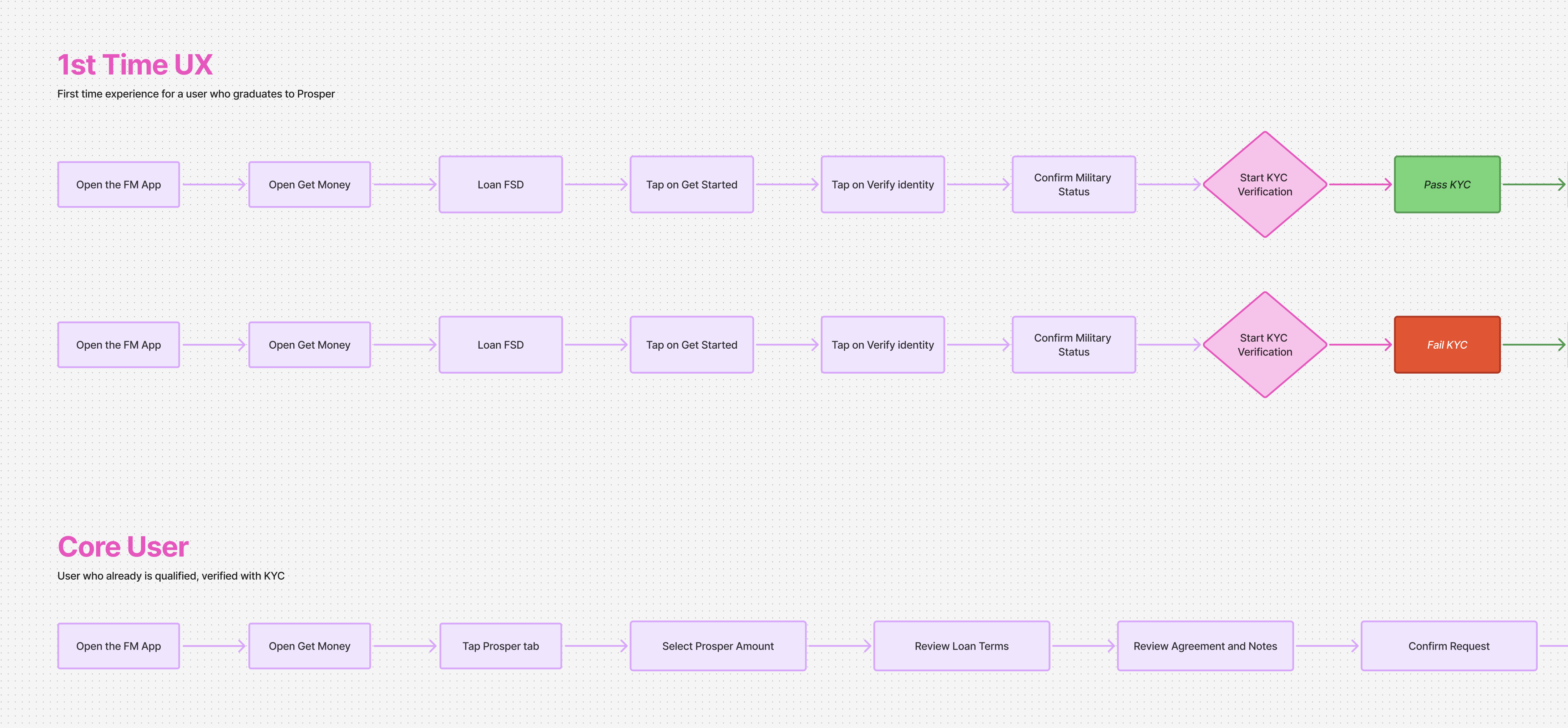
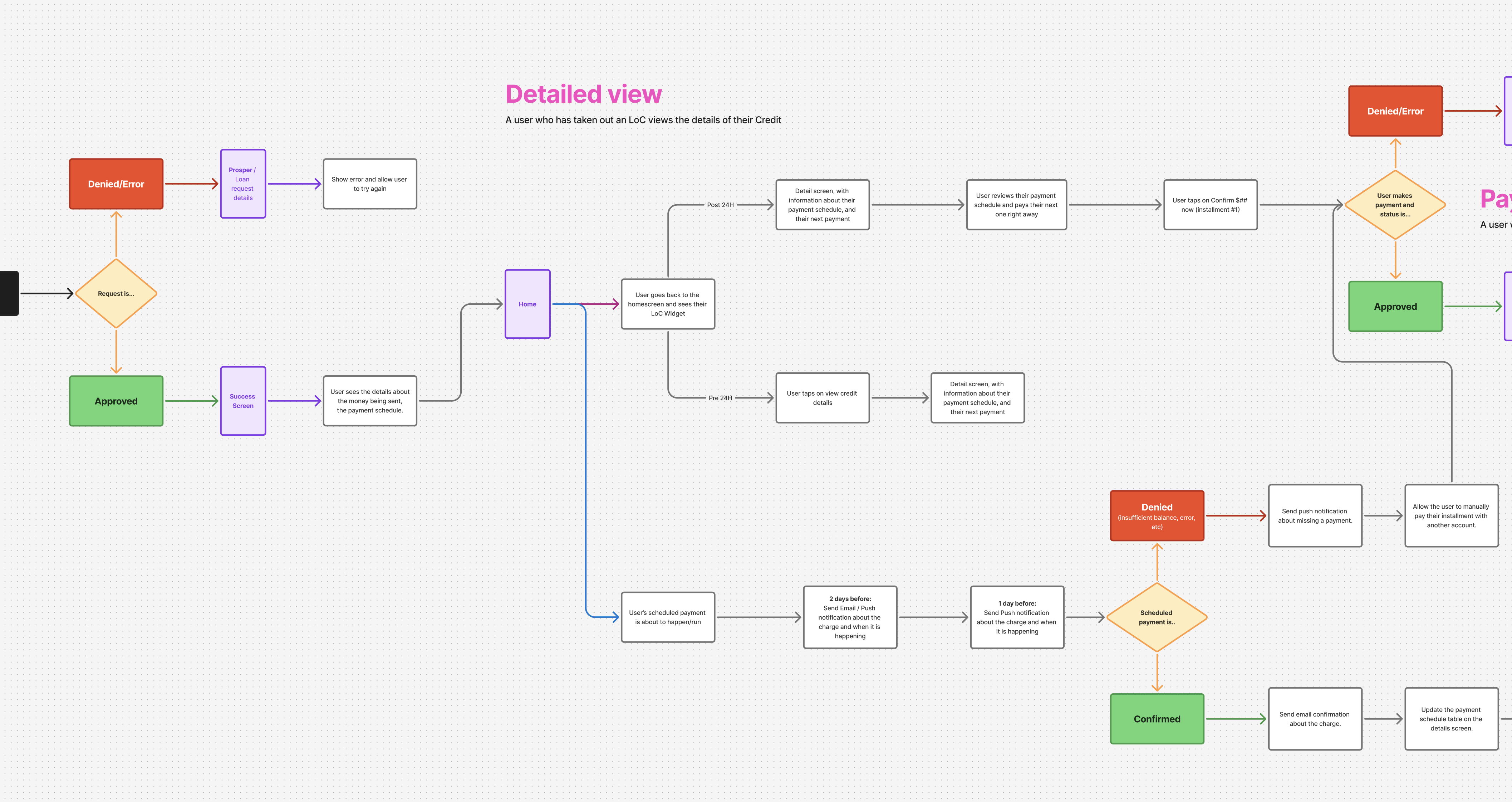
Before moving into UI design, I focused on understanding the complete experience from end to end. I created User Task Flows and Journey Maps covering every major scenario we could identify, from first-time applicants and successful approvals to verification failures, repayment states, and edge cases.
These artifacts became the foundation for conversations between Product, Engineering, QA, Compliance, and Design. They helped us identify gaps early, uncover requirements that hadn’t been considered yet, and align around a shared understanding of how the product should work.
Testing our assumptions
One assumption came up repeatedly during planning discussions. Loans require more information than Floats, which meant the application process would naturally be longer. We believed users would be more likely to abandon the experience as additional steps were introduced.
Rather than guessing, we tested it.
I created a series of prototypes and ran multiple rounds of testing with more than sixty users. The goal wasn’t to validate visual design. It was to understand whether people could successfully move through the process, understand the information being presented, and make informed decisions.
The results challenged our assumptions. Users were willing to complete a longer application flow as long as the experience felt clear and understandable. What caused friction wasn’t the number of steps. It was confusion.
That finding influenced almost every design decision that followed.
Designing the Loan experience
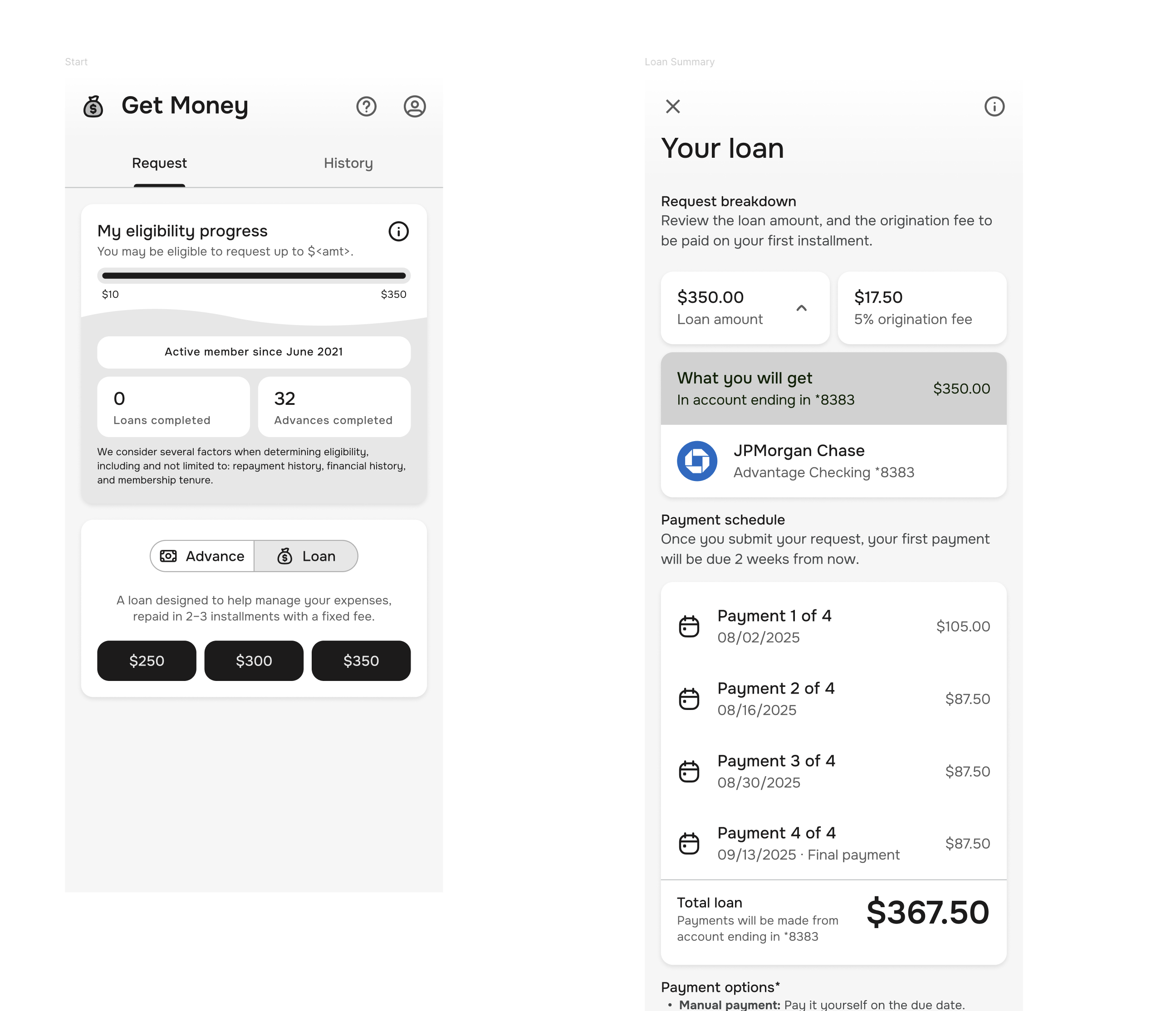
The final application flow was intentionally structured around a series of smaller decisions. Users moved through:
- Introduction
- Military status verification
- Identity verification
- Eligibility checks
- Amount selection
- Loan summary
- Confirmation
Breaking the experience into smaller steps gave users time to process information without feeling overwhelmed. This became especially important as we introduced concepts that didn’t previously exist in the Float experience, such as repayment schedules, APR, and origination fees.
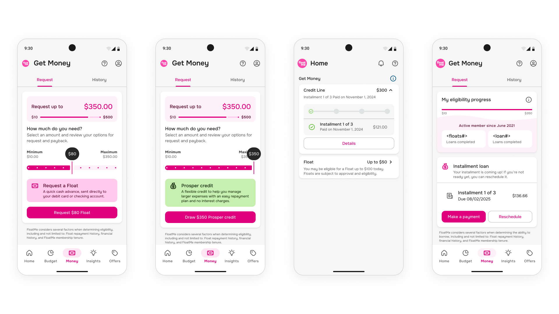
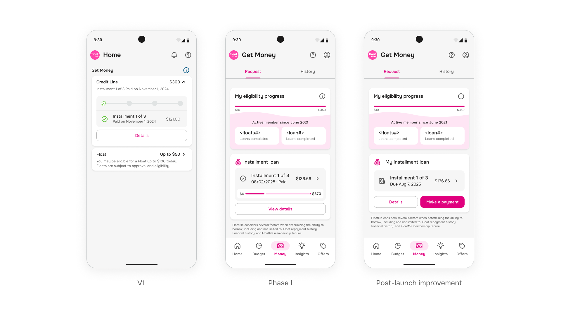
One area that evolved significantly throughout the project was the Installment Loan widget itself. My early concepts contained far more information and attempted to answer too many questions at once. Through testing, internal reviews, and iteration, I gradually simplified the widget until it focused on what mattered most. The final version communicated the essential information while remaining easy to scan and understand.
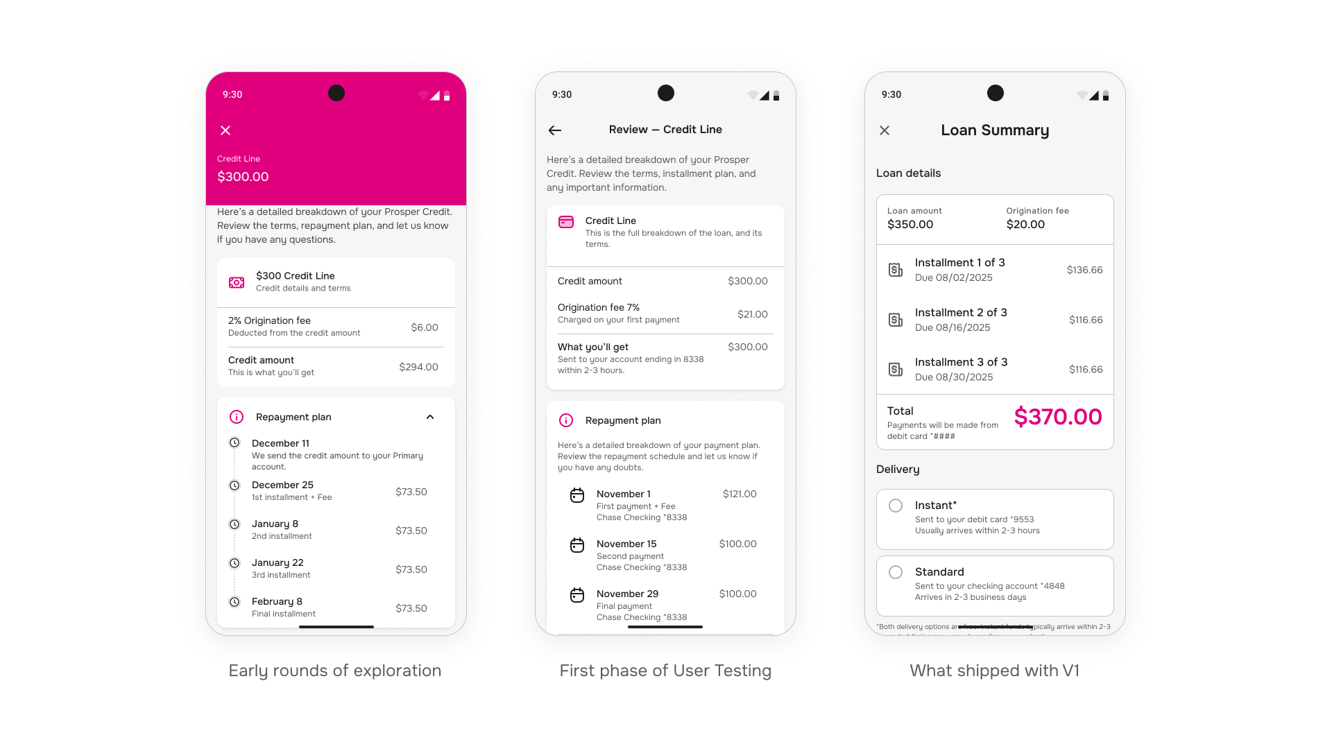
The Loan Summary Screen
Out of all the screens in the experience, the Loan Summary took the longest to get right.
This was the final moment before a user committed to taking out a loan. It needed to communicate the loan amount, repayment schedule, APR, origination fee, payment method, and required disclosures without overwhelming the user.
I explored multiple layouts, tested different information hierarchies, and adjusted the content repeatedly based on feedback. Throughout the process, one thing remained consistent: users cared most about understanding how much they would repay and when those payments would happen.
That insight shaped the final hierarchy of the screen. Rather than treating repayment details as secondary information, I made them one of the primary elements of the experience.
Repayment tradeoffs
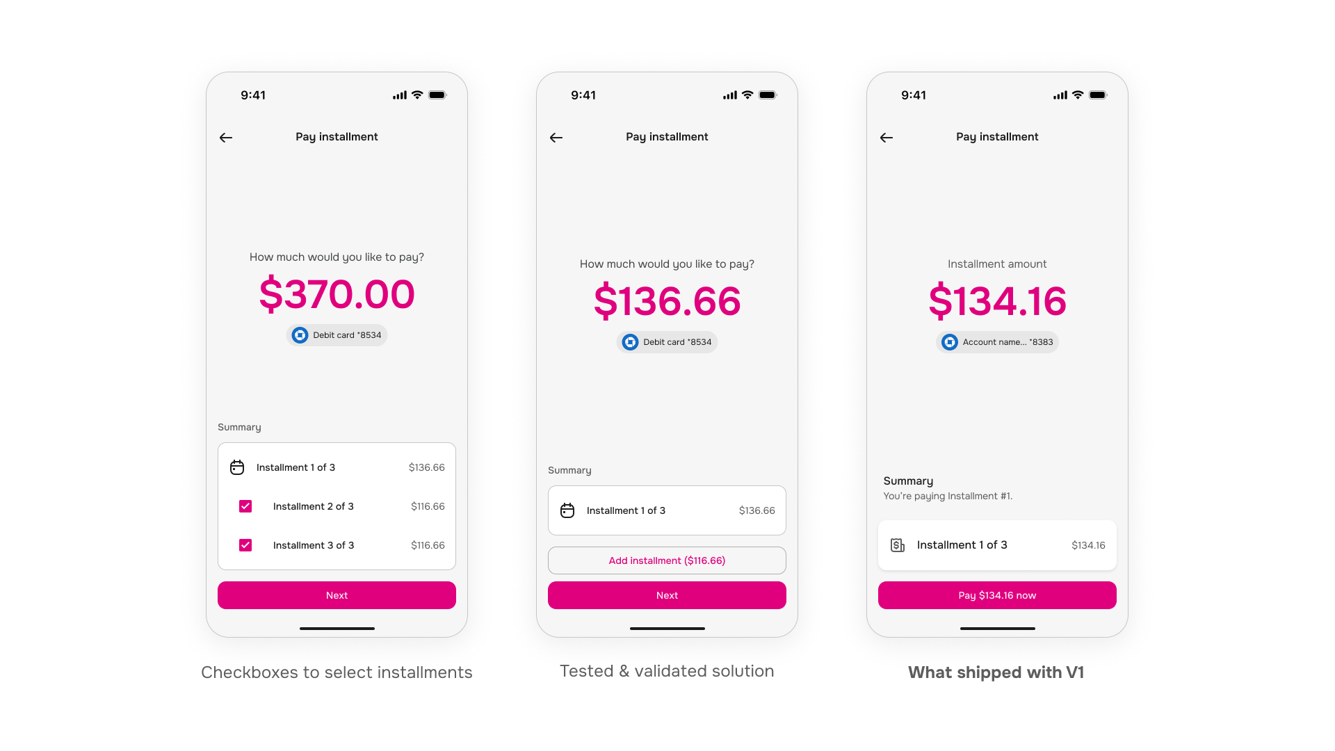
Repayment became one of the most heavily discussed parts of the project.
During testing, users responded positively to several repayment concepts we explored, including the ability to make custom payments, pay multiple installments at once, and pay off a loan early.
These concepts tested well and gave users more flexibility when managing repayment. The challenge was scope.
As we approached our launch deadline, we had to decide whether to continue expanding the repayment experience or simplify it for the initial release. While I personally preferred the more flexible approach, the reality was that we needed to ship.
The decision was made to reduce scope and focus on a simpler repayment flow for version one.
Looking back, I still believe those additional repayment options would have improved the experience. At the same time, launching the product and validating demand was ultimately the right decision. Some of the best product decisions aren’t about building everything you want. They’re about knowing what can wait.
Visual Design
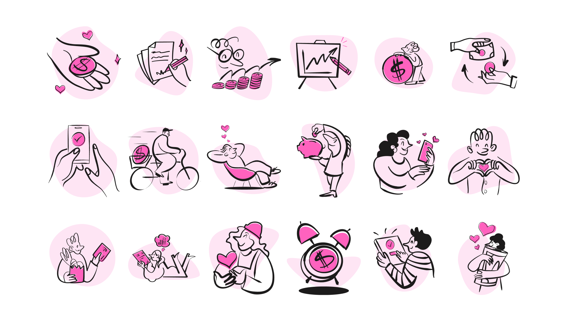
Loans can feel intimidating, especially for users who are encountering them for the first time.
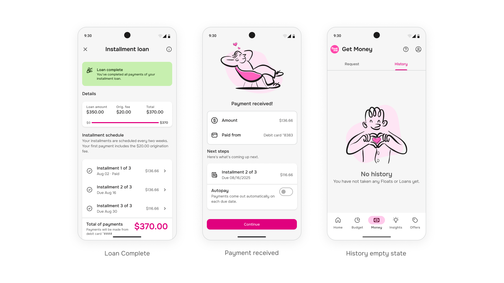
To make the experience feel more approachable, I designed a series of illustrations that appeared throughout the flow. These were used during onboarding, verification states, success moments, and widget states.
The goal wasn’t to decorate the experience. It was to make a more complex financial product feel familiar and approachable.
Combined with clear language and interaction patterns that already existed within FloatMe, the illustrations helped connect the new lending experience back to the rest of the product.
Launch
Installment Loans launched in December 2025 through a limited rollout in Texas. The initial release targeted a small group of high-standing FloatMe members, allowing the team to closely monitor adoption and gather early feedback before expanding availability.
We set a very simple success benchmark: Have one real user successfully take out a loan.
Within the first week:
- 25 users received access
- 17 completed identity verification
- 15 successfully took out a loan
The benchmark was exceeded almost immediately.
What stood out most wasn’t the conversion numbers. It was how closely real-world behavior matched what we had observed during testing. Users moved through the flow in the way we expected, understood the repayment schedule, and successfully completed the process without major surprises.
That alignment between research, testing, and production gave the team a lot of confidence in the work we had done.
What I Learned
This project reinforced something I’ve seen repeatedly throughout my career. The quality of the final design is heavily influenced by how well you understand the problem before you start designing.
A lot of the success of this project came from research, conversations with users, testing, and iteration. The visual design mattered, but many of the most important decisions happened long before the final screens existed.
It also pushed me to become more comfortable owning a project from beginning to end. I participated in product definition, research, testing, UX, UI, launch preparation, and post-launch monitoring. Seeing the entire process play out gave me a much deeper appreciation for the work required to bring a new product to market successfully.
If I were revisiting the project today, I’d continue expanding the repayment experience and revisit some of the concepts that were cut due to scope. The demand was clearly there, and I still think there’s room to make repayment more flexible without adding unnecessary complexity.
The biggest takeaway remains the same: Understand your core user.